“Designing a label is different to what we usually do and I had never made one before. And it is rewarding to be alongside so many other artists who have been a part of this collection”
As we were unable to meet in person, the invitation was made via Zoom in February 2021. We were all going through one of the most uncertain times of our lives, and this is how we would be speaking with the artist Jorge Queiroz throughout the entire process of creating the new label for Esporão Reserva White.
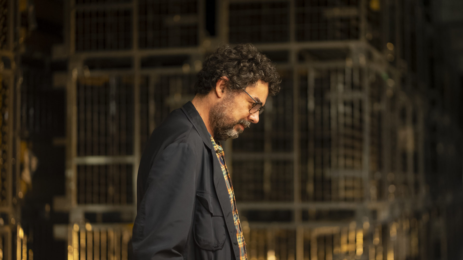
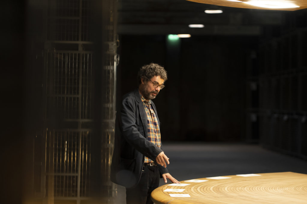
Months later and with the artwork completed, we finally met at the birthplace of this wine – Herdade do Esporão. In our wine cellar, in the basement, with the artwork in front of us, the artist reminisced about the whole journey he had made up until this point. “I was very happy to receive the invitation. As well as Esporão being a brand that I was already familiar with, the artist who was invited in 2014 was my brother João Queiroz. Designing a label is different to what we usually do and I had never made one before. And it is rewarding to be alongside so many other artists who have been a part of this collection”.
Besides the recognition and prestige of being alongside other artists with his artwork, it was the exercise itself, the challenge, which made him accept and continue. “Designing a label projects our work into another dimension. How do you create a piece knowing that it is going to serve that purpose? I approached the project as a challenging exercise”.

The perception of what a bottle is, its weight, what appears on the label and imagining the wide range of people who will see the image, in different contexts – these were some of the considerations that were made during the creation process. “When you go to an exhibition you are expecting to see an exhibition. When you see a picture on a bottle, it is not because of the picture. That picture will be present in various contexts, at special moments. I wanted the label itself to be a topic of conversation”.
Trying to imagine the places where a label will be present is an endless process. A label is an artwork that is transported, exported, ignored, but it could also be a detail that stands out, and it could even be a deciding factor at the moment of purchasing a wine. “I researched and examined a lot of wine labels, and it is very hard to understand the reasoning behind every choice and their inspiration. It was interesting to think and imagine that place – what it is and what it will be. Thinking about all of this is very interesting for someone who is doing an exercise like this.”
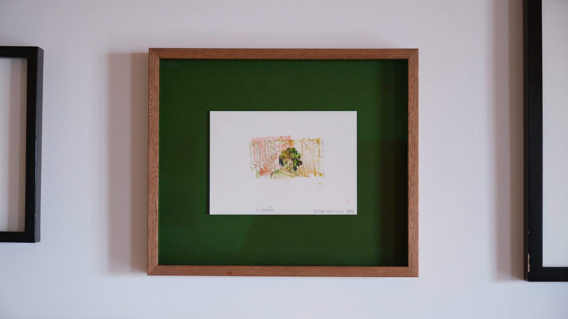
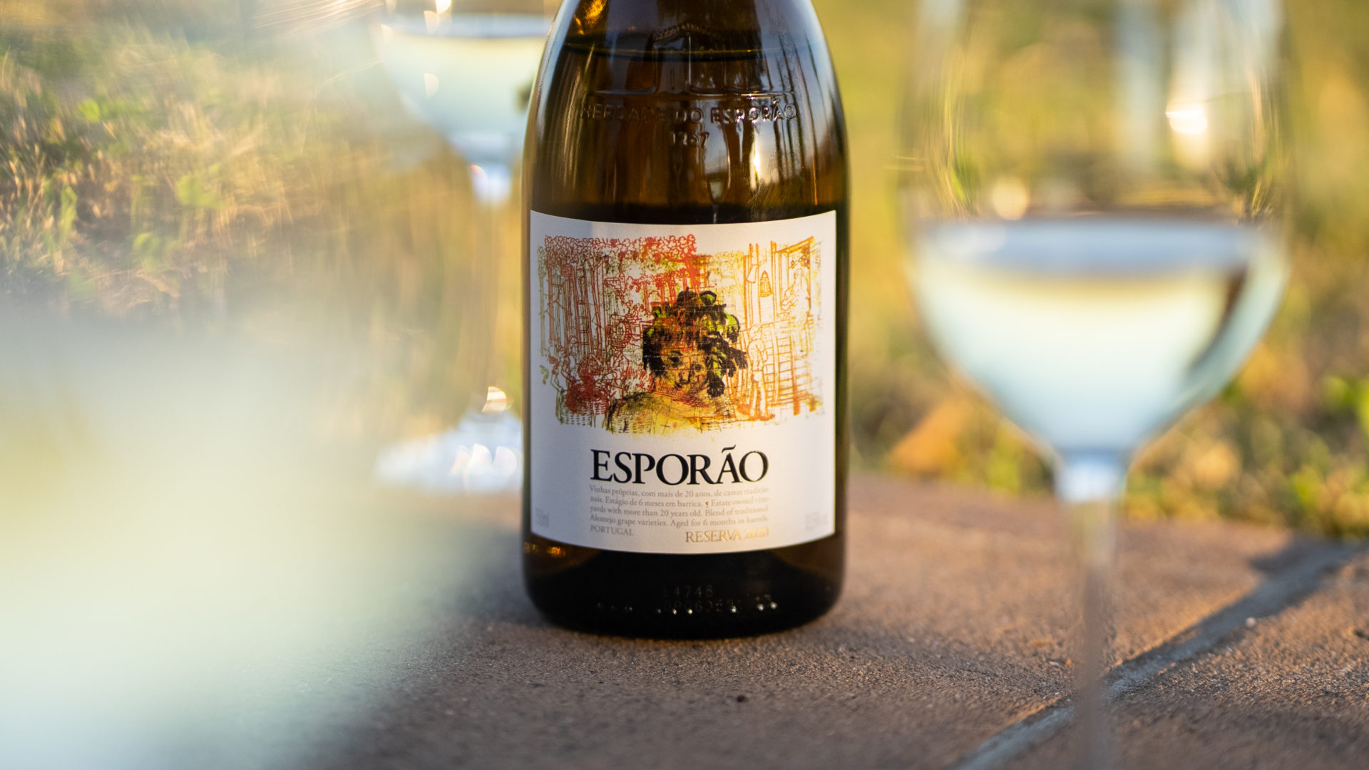
The label for Esporão Reserva White is part of a set of six designs that the artist considers just one piece of art – a story divided into many parts. When we look at this picture in particular, an image of Dionysius (god of wine in Greek mythology) stands out in the middle, embedded among images that represent the winemaking process. “The process of making wine appears as a forced, repetitive mark, and there is a kind of web holding the inventor, Dionysius. The choice of colours was a matter of personal taste and also the possibility of choosing paint, mixing colours and creating contrasts. The pencil had to be a different colour in order for its colour to overlap.”

By bringing together these two worlds alluding to wine – its production and its consumption – the artist reached the place he was striving so much for. “It is funny to have created a design for something so specific. It has its own characteristics that you have to think about, which gives me plenty to work with. The place of the wine label is different to any other design I have made. Making this type of design has its own problems and that is what is interesting about it.”
Esporão Reserva White 2020 is now available in Portugal and elsewhere. Now we are able to really see this place that Jorge imagined and that served as his inspiration. It will always be unique and special, for each moment, each context, for each and every one of us. Just like the contents of the bottle itself.

